
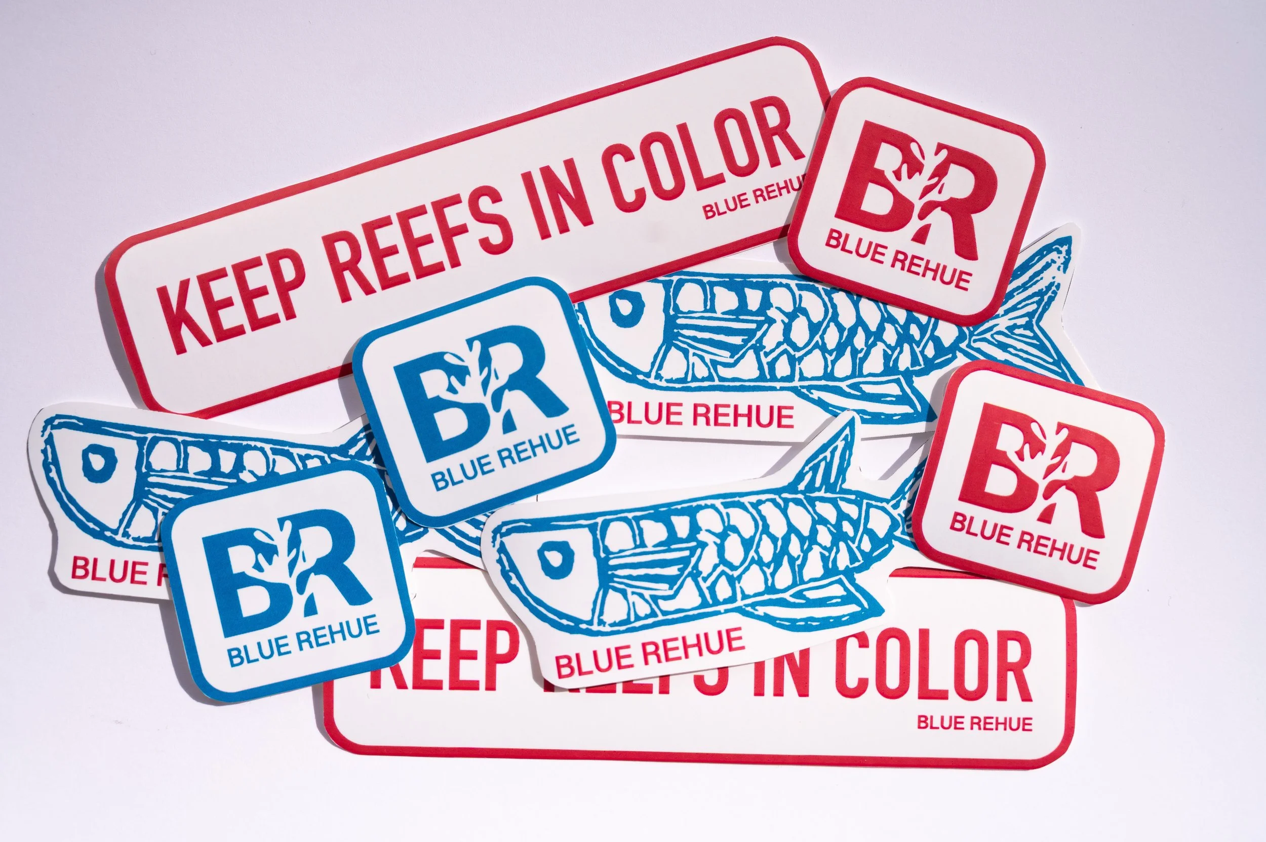
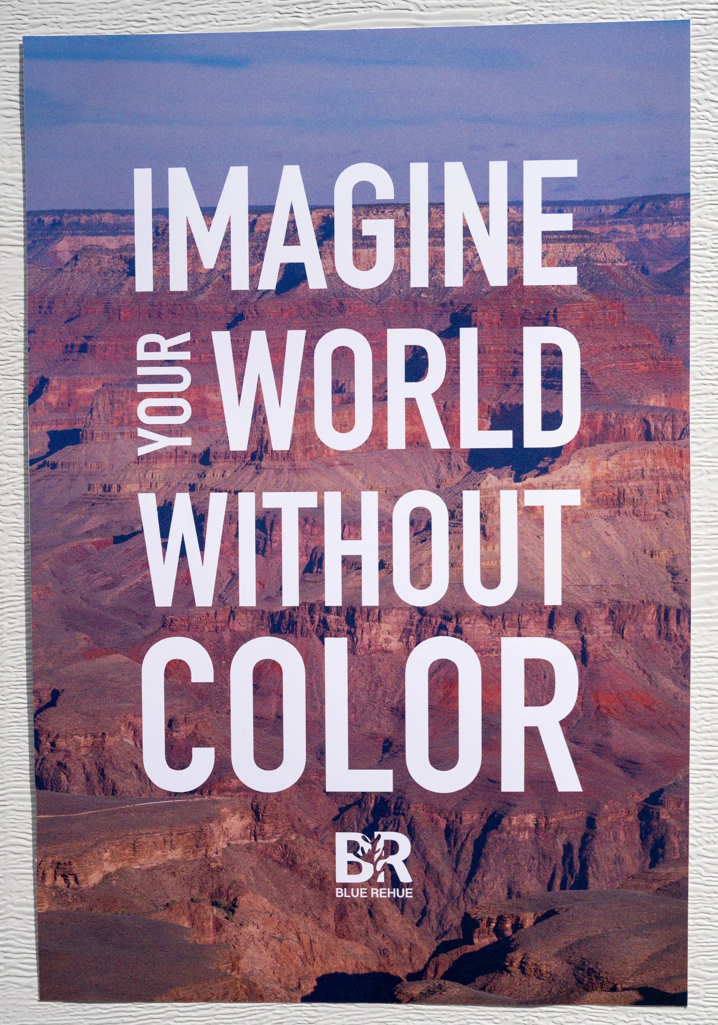
BLUE REHUE
BRANDING/ DELIVERABLES FOR NON-PROFIT
Not enough is being done to stop coral bleaching. Graphic design is persuasion and persuasion can be used to make change — the change that fish need to survive.
WHY
Fish are able to see more colors than humans can see, but their world is losing it’s color. Fish are feeling the affects of what they are watching change, but the concept that fish can see this change is under represented. I am using this as an opportunity to reach an untapped angle in a fight against climate change, specieis harm and coral bleaching.
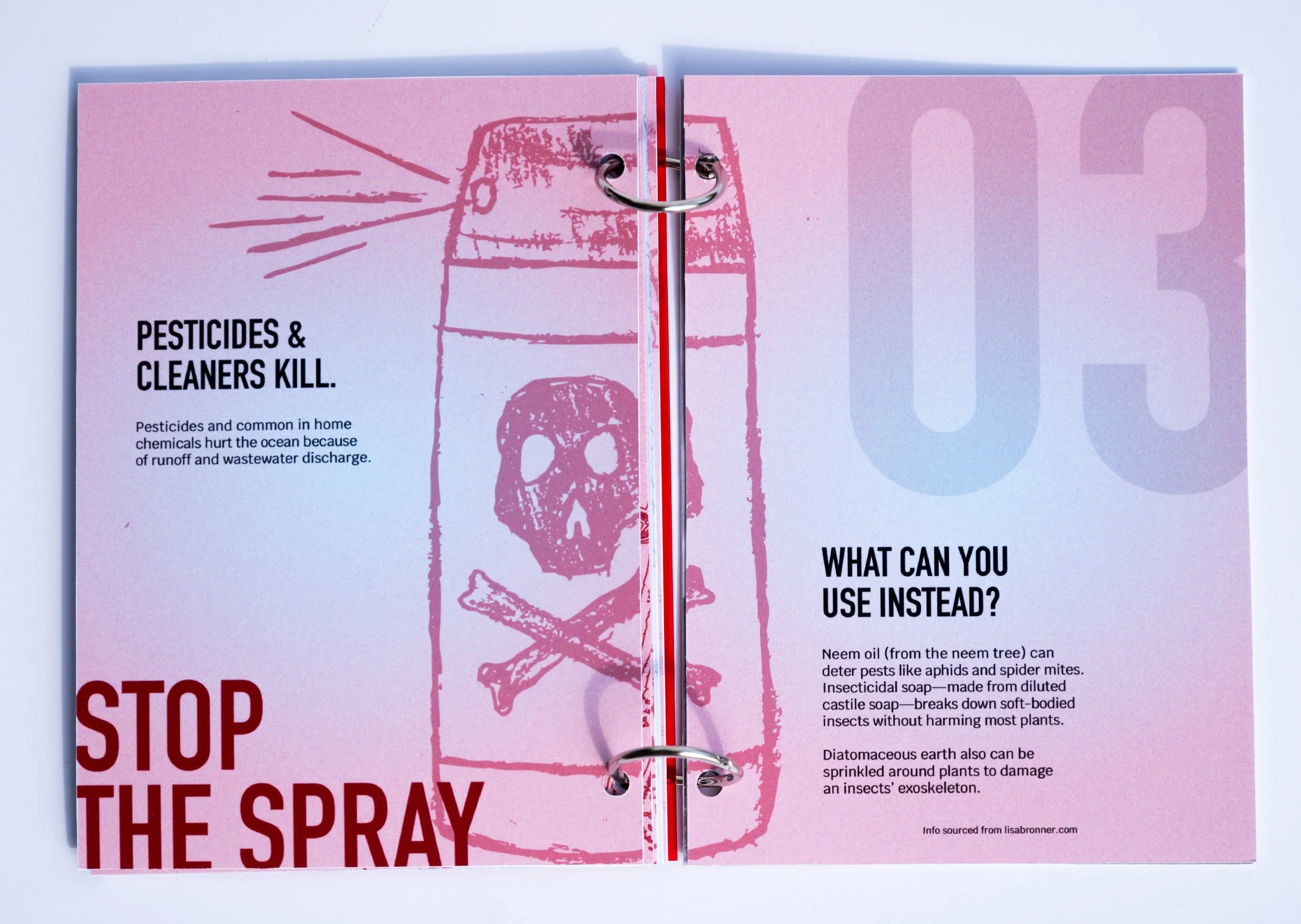
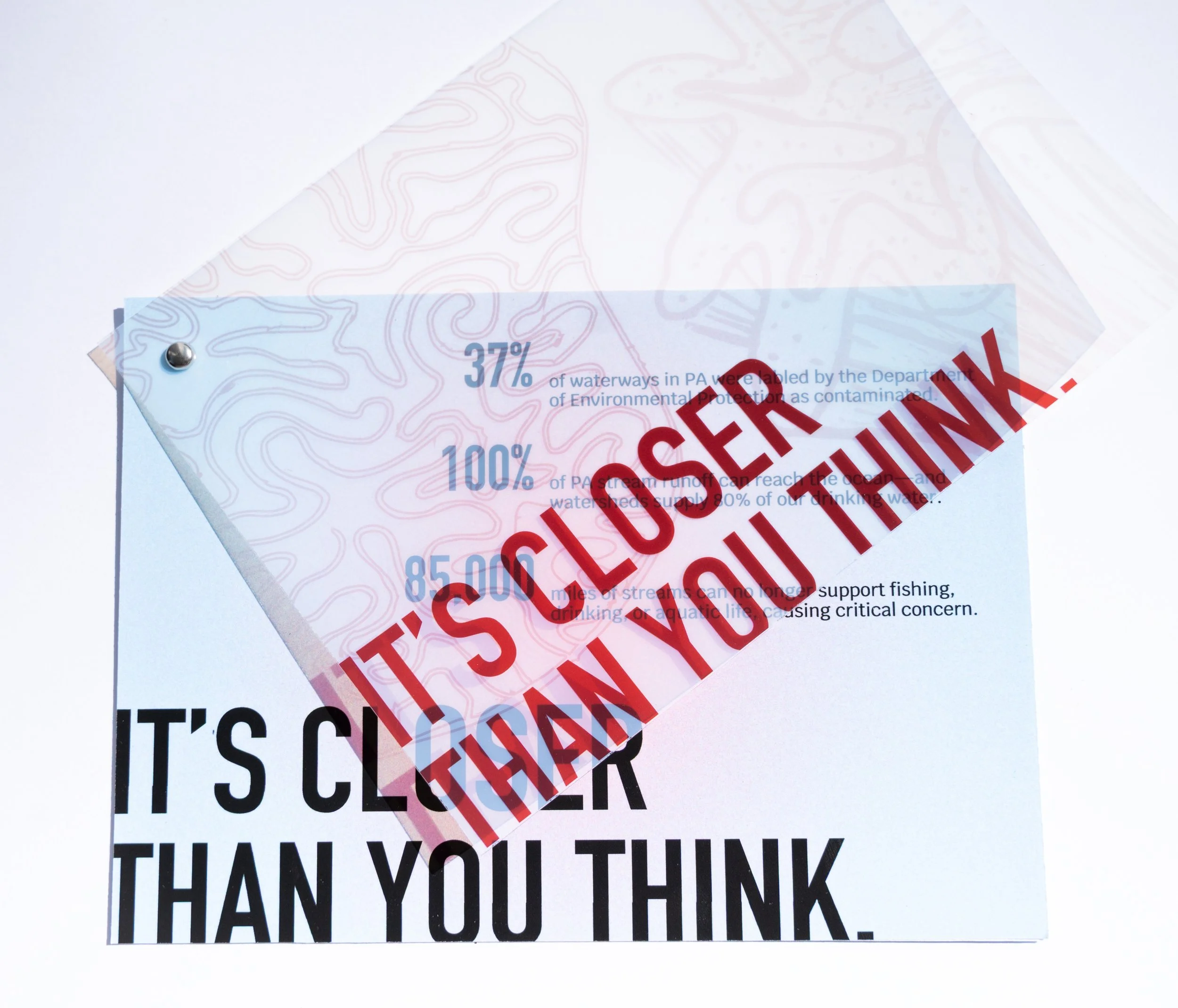
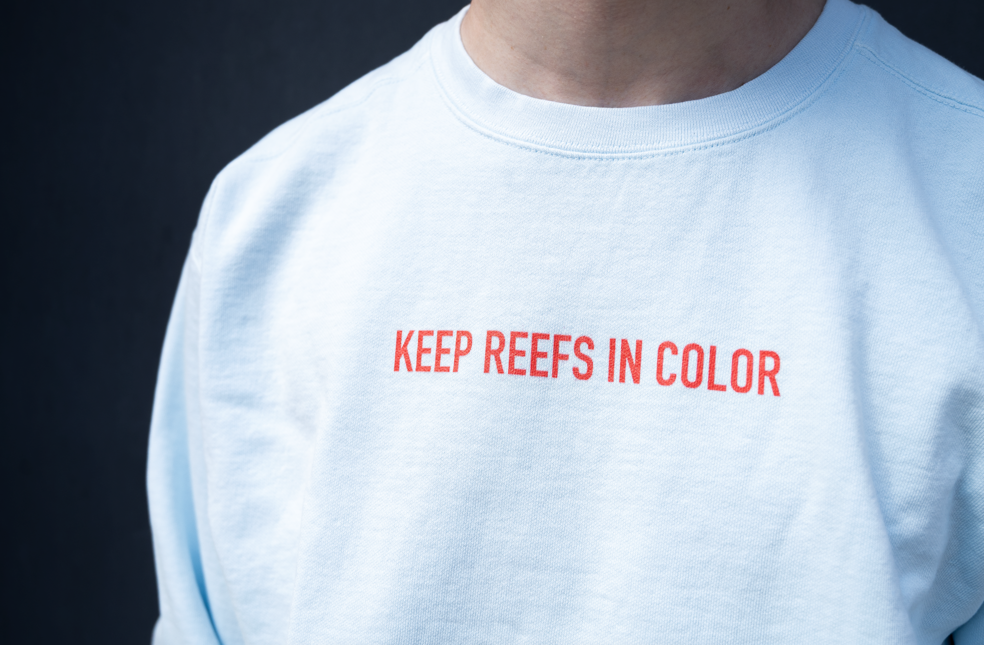
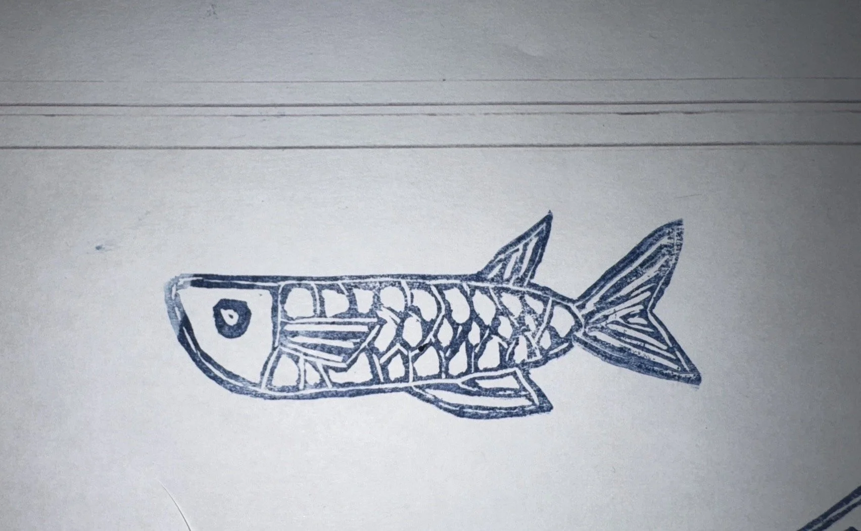
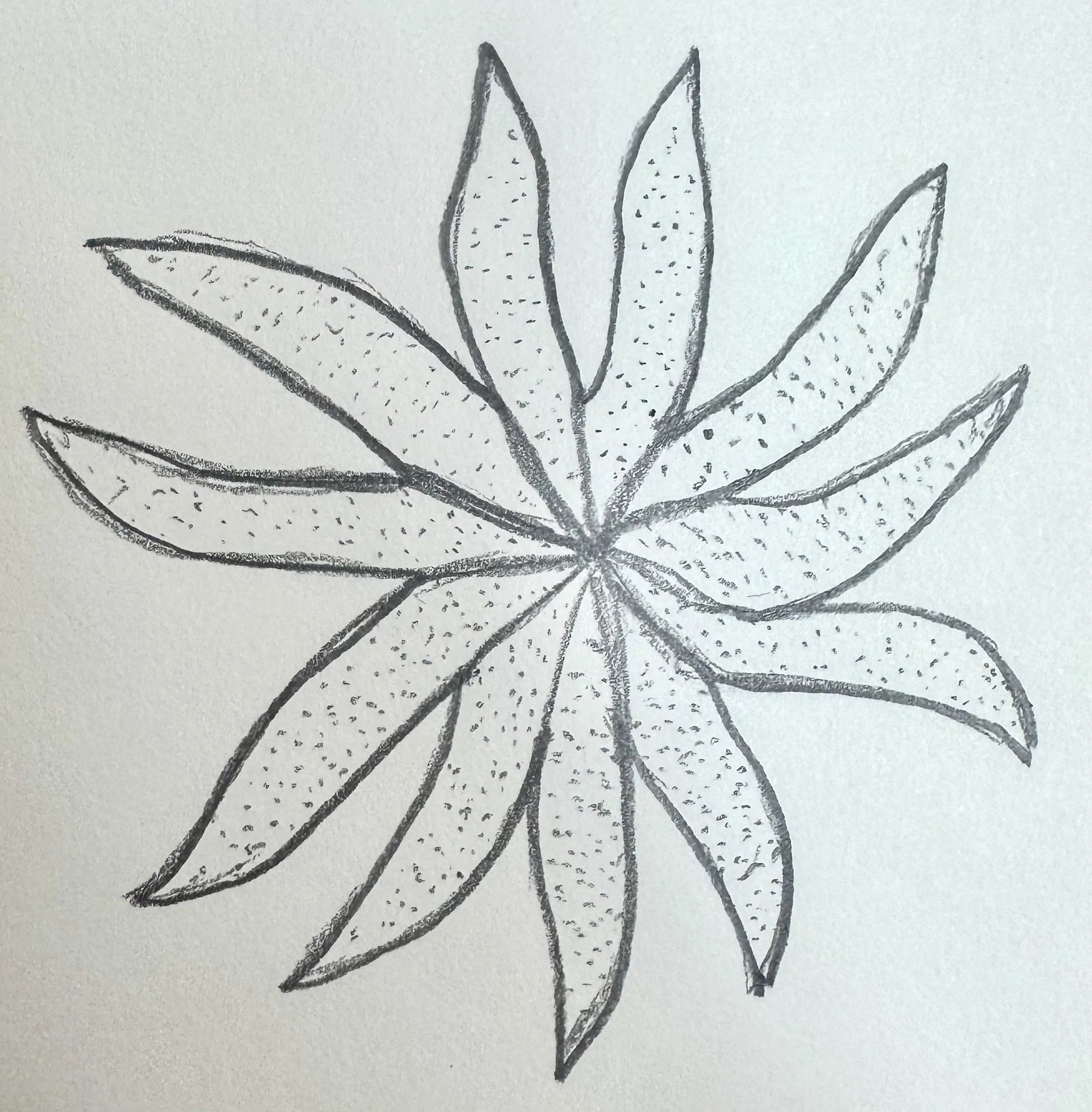
Fish can most vividly see red and blue. Using those colors and printing techniques I am demonstraiting that color loss above water. I am also aiming to educate people on ways they can help reduce their harmful actions.
NOTES
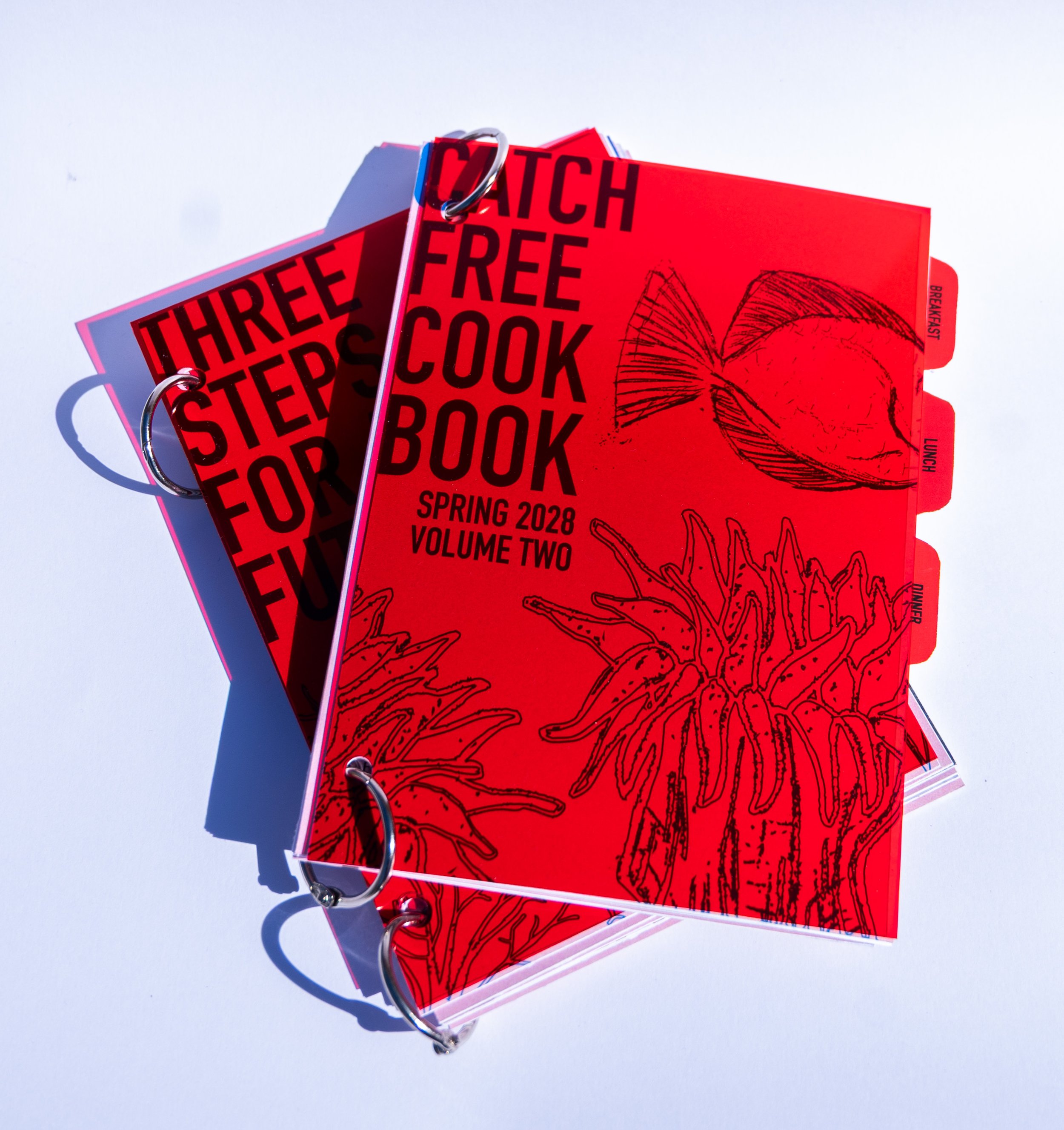
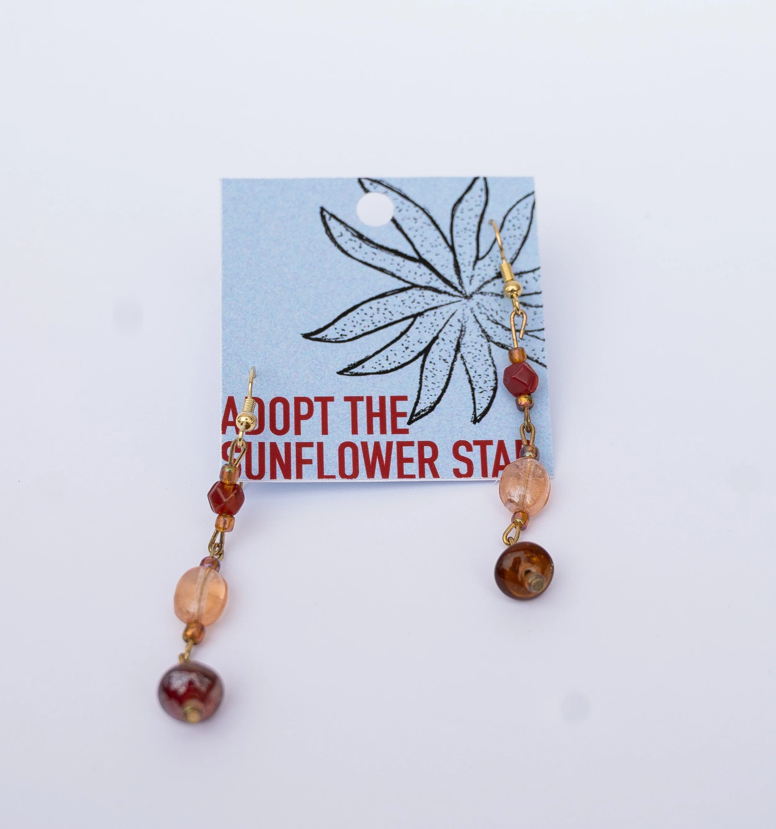
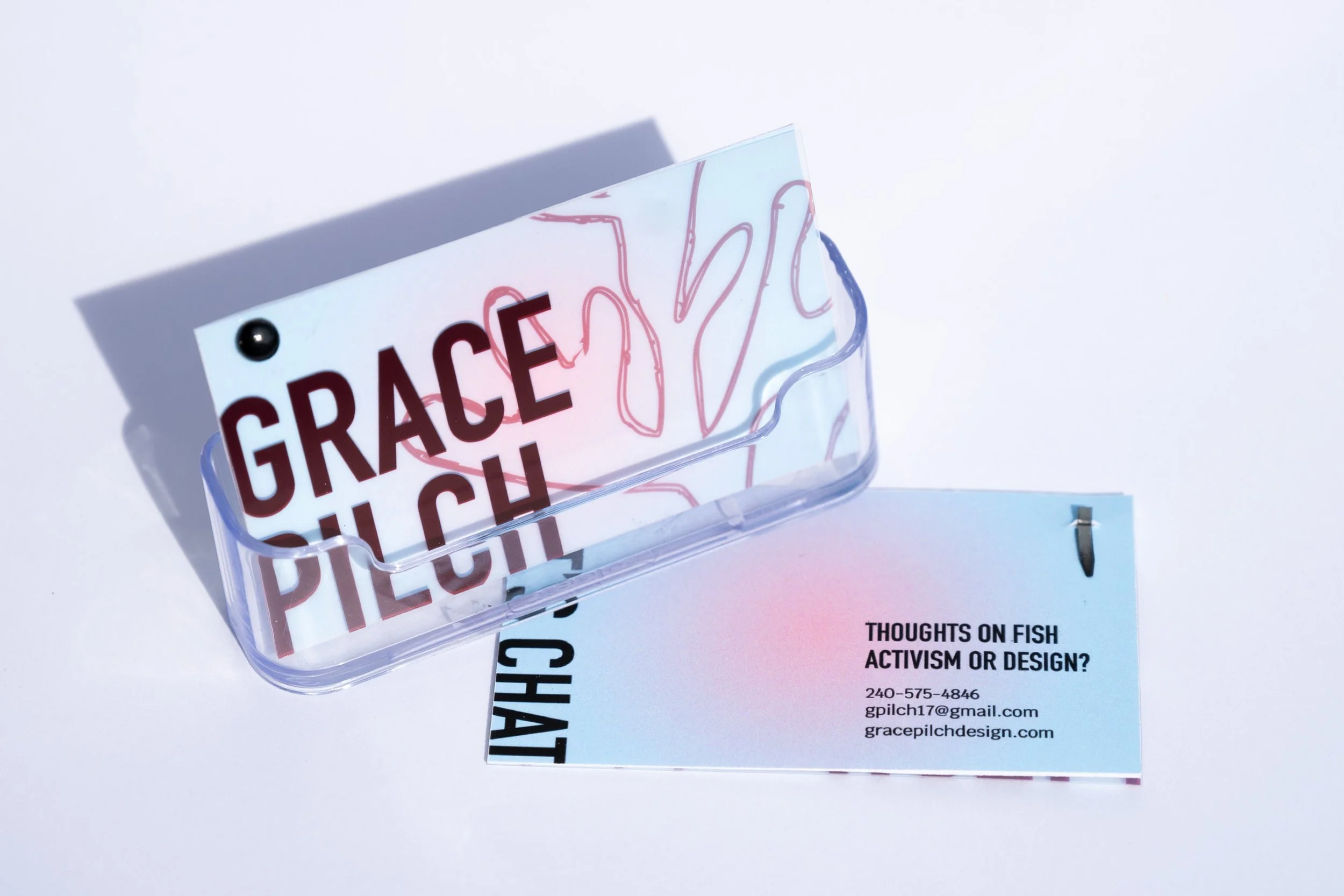
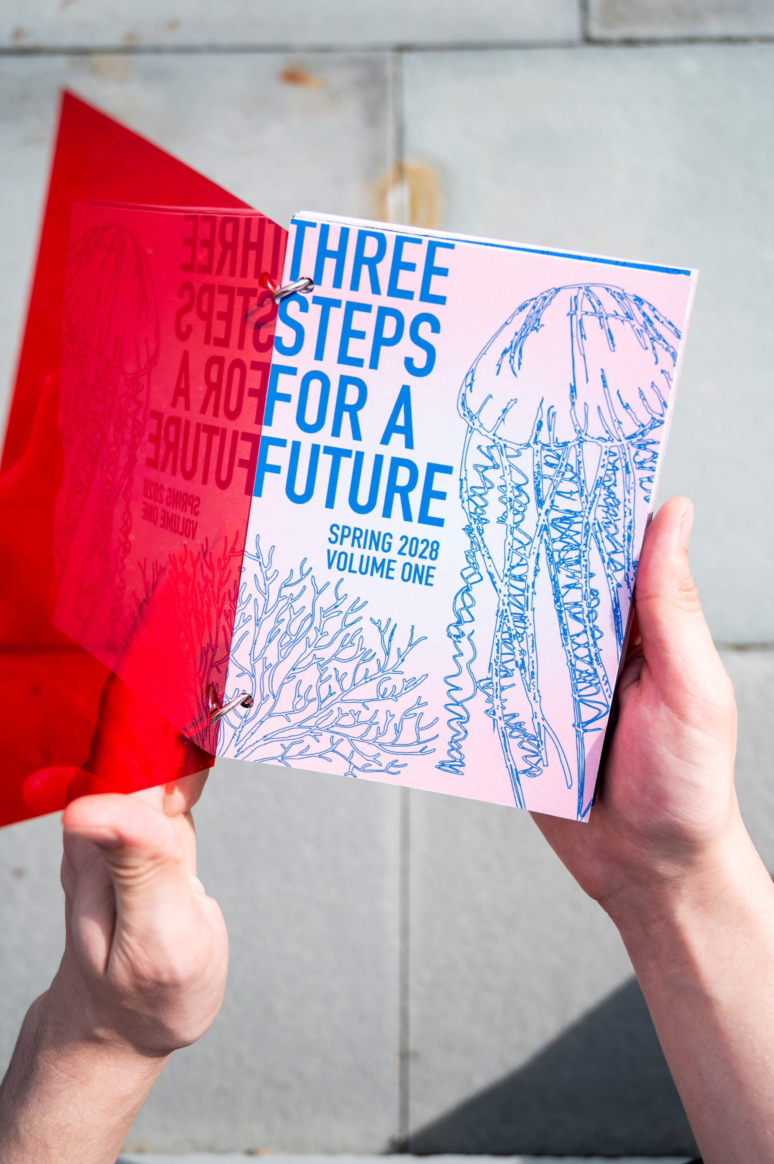
Create a brand system and deliverable set for a non-profit focused on building human empathy for salt water fish in a fight against coral reeef bleaching. The deliverables include posters, stickers, sweatshirts, publications, business cards, and jewelry aimed on raising money through supporters symbolically adopting a fish.
BRIEF/ GOALS
PROCESS
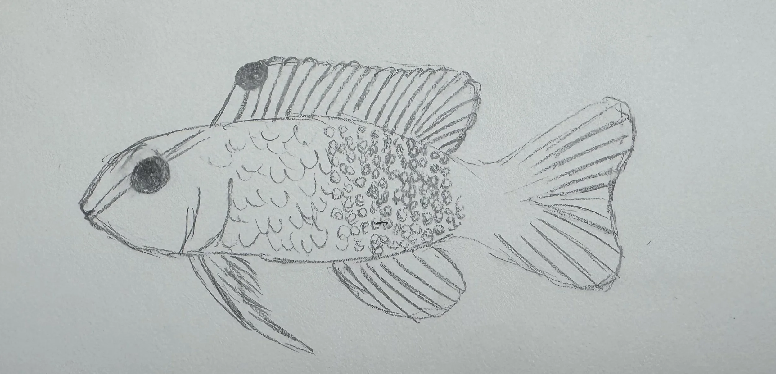
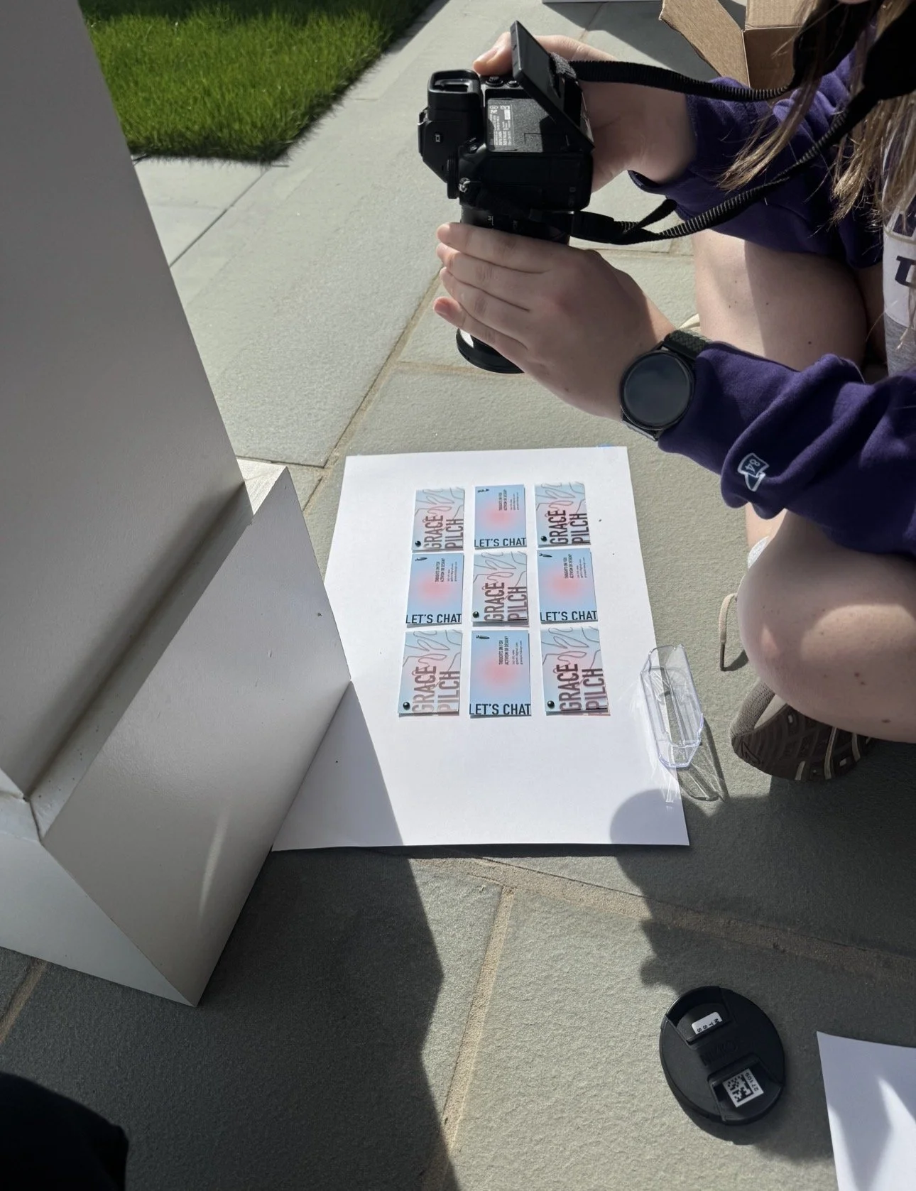
The toughest part of this project was developing a brand style. It was more branding than I had ever done. Once the system was created, though, immplementation went smoothly. I also was able to put new skills to the test, such as jewelry making, priniting on unconventional materials, and directing/executing product photos.
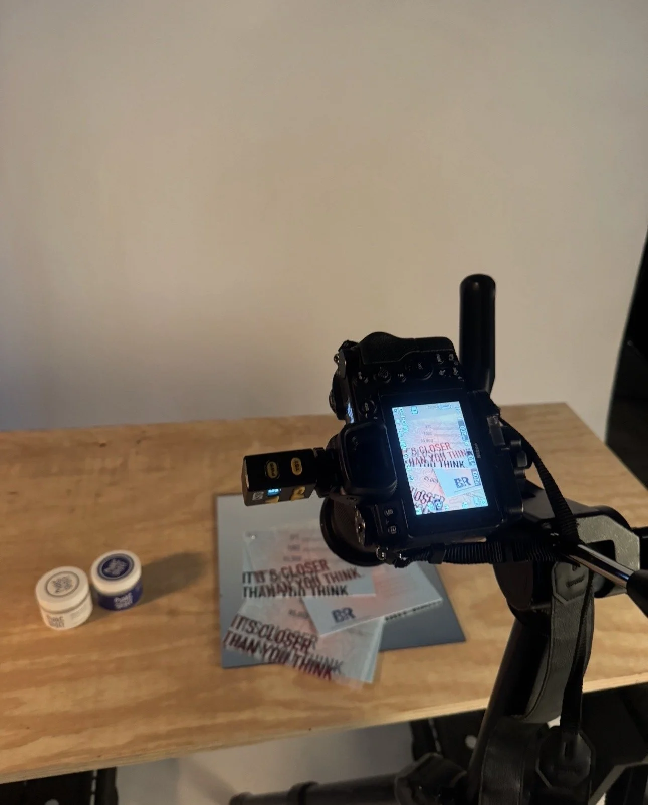
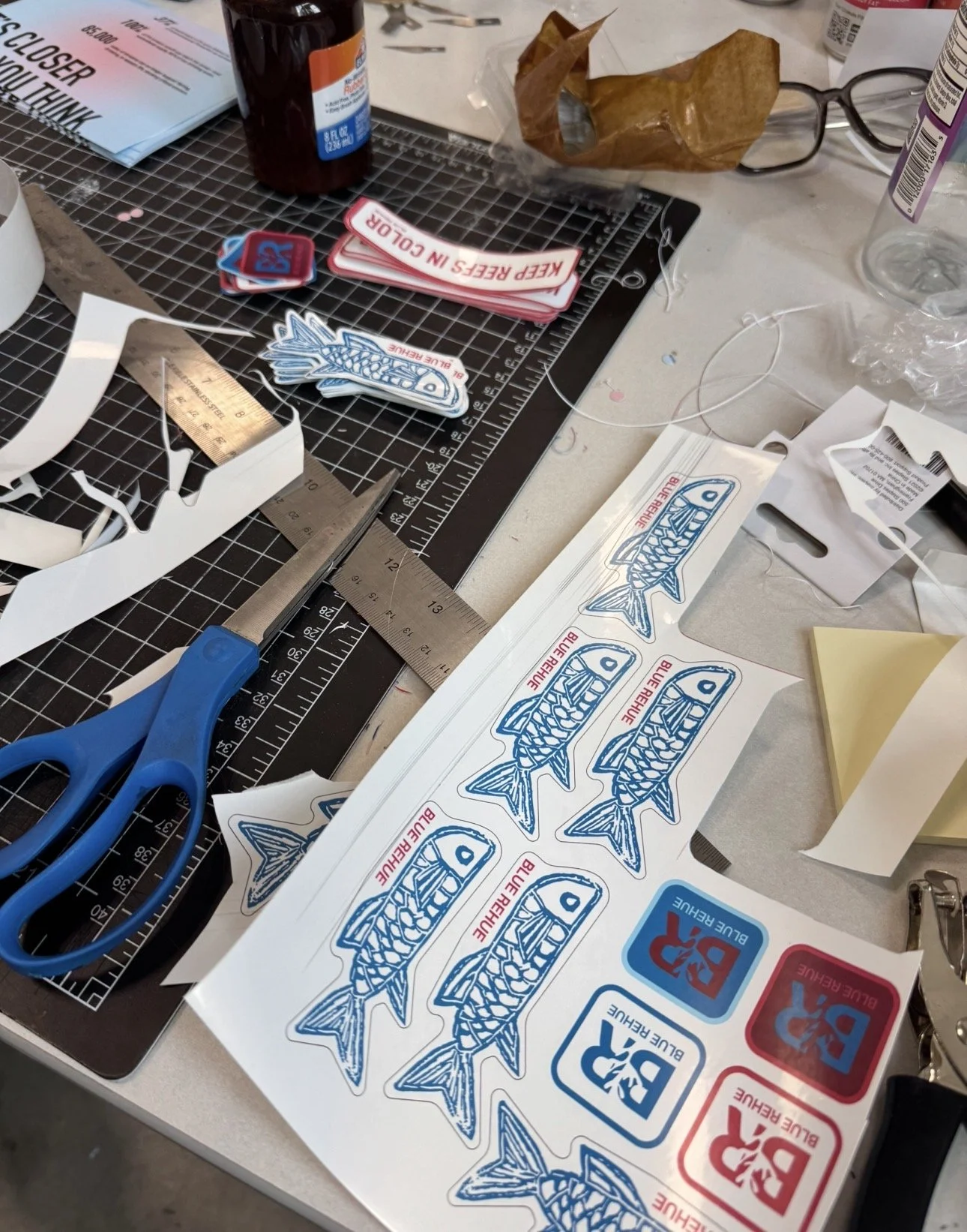
I firmly belive that design is best documented when it is done in real life, instead of a mock up. Subsequently, for this project there were a lot of delvierables to photograph and craft myself. There were a lot of flat lay combinations, many proofs, and infinite spelling checks until work proved successful.